Gopuff is a digital delivery service that operates in 650 US cities, marketed towards delivering every-day essentials for millennials. They started in 2013 out of college students, Rafael Ilishayey and Yakir Gola's townhouse. They initially were delivering out of their own car around their campus, and now it is a cross-coastal corporation.
Note: In their logo-type Gopuff is stated as "goPuff", in text placements it is written out as Gopuff. I chose to stick with the system they had working for them in my project.
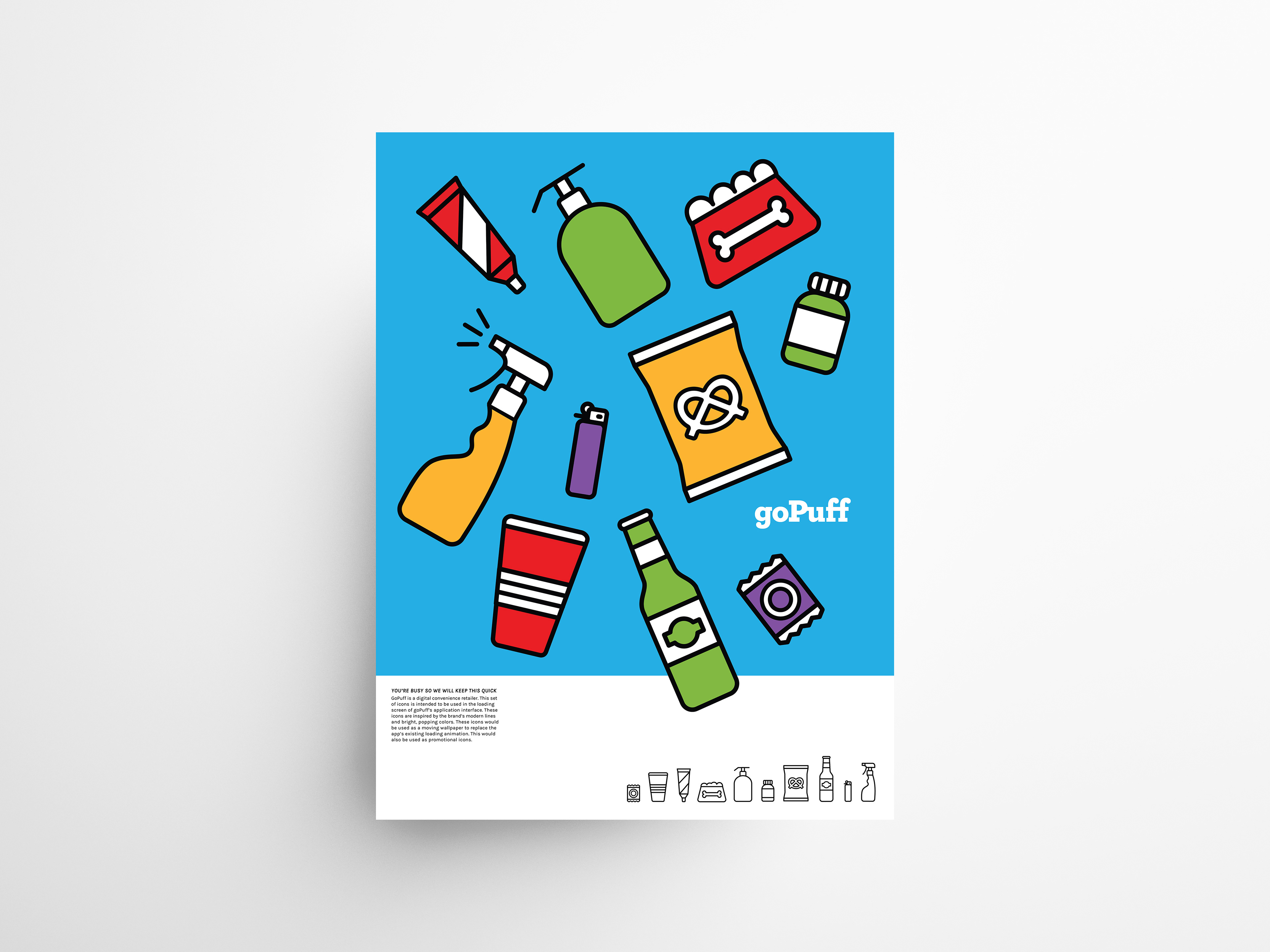
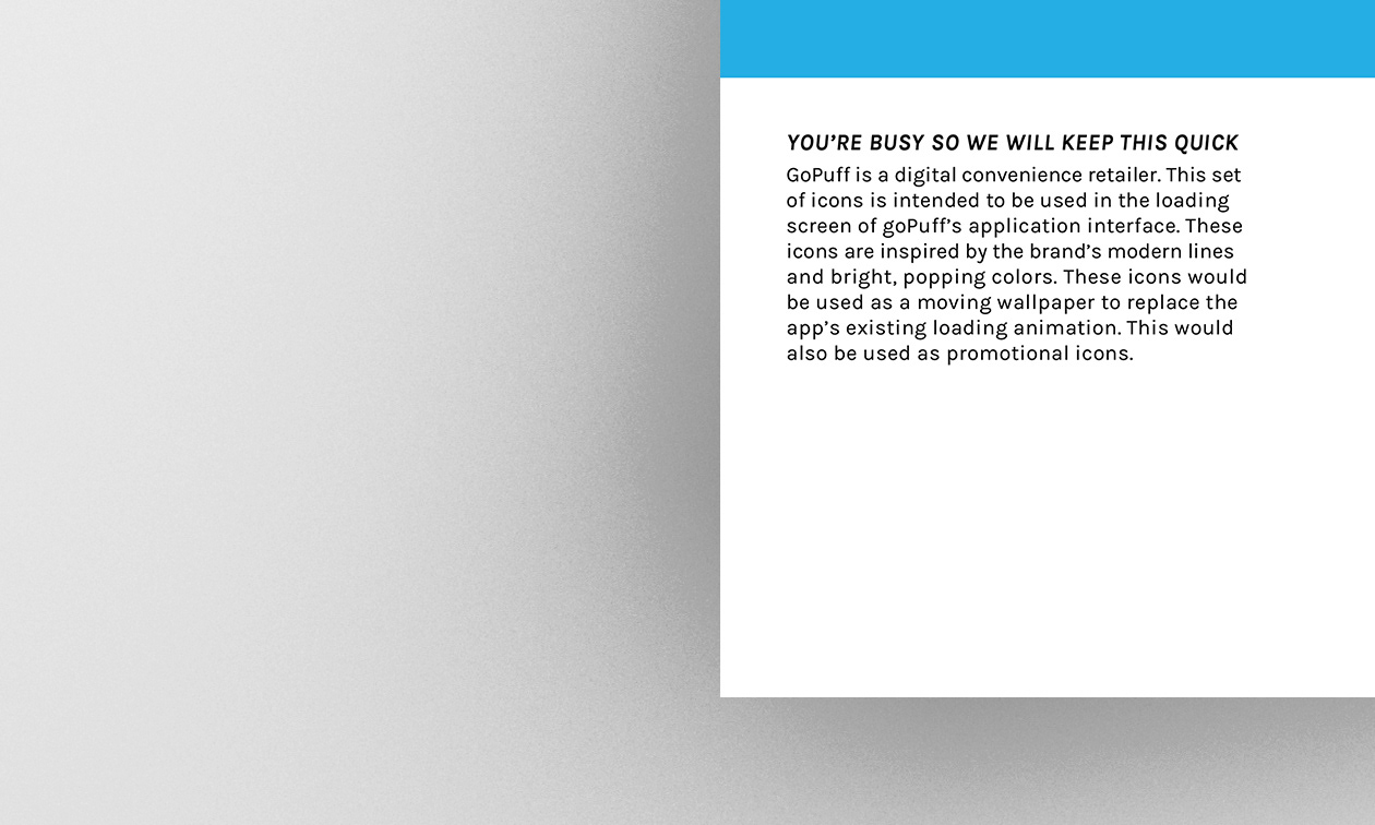
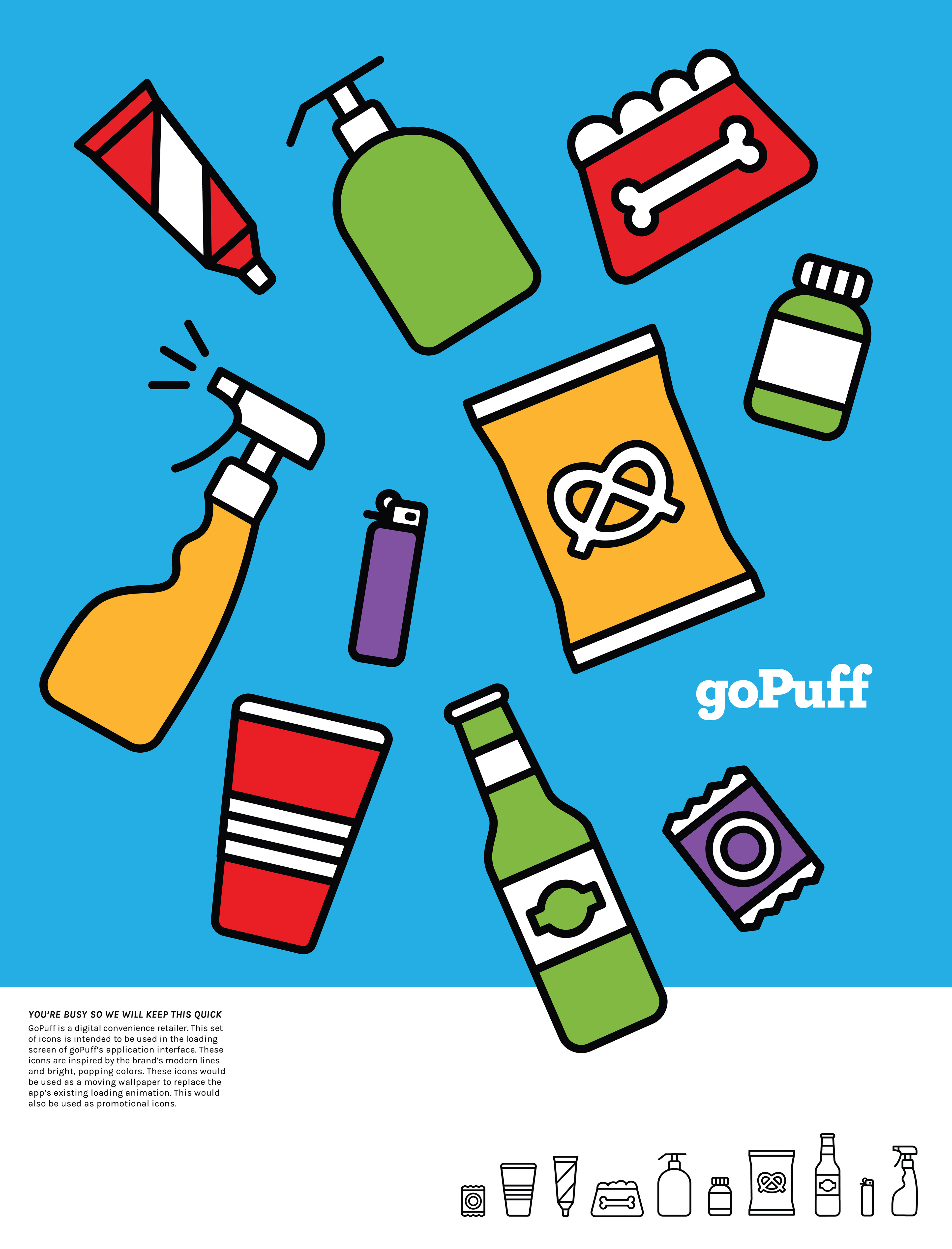
Final Deliverable
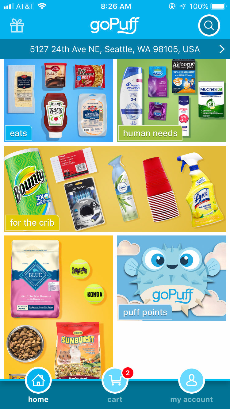
Gopuff has a special place in my heart, helping me make midnight candy deliveries a whole lot easier, I had, however, always found their interface quite overstimulating and hard to use.
A new symbol set and logo had the opportunity to better reflect their college consumer base, to be more energetic and on trend.
Note: After I completed this project they went through a rebranding, this is the interface from 2019.
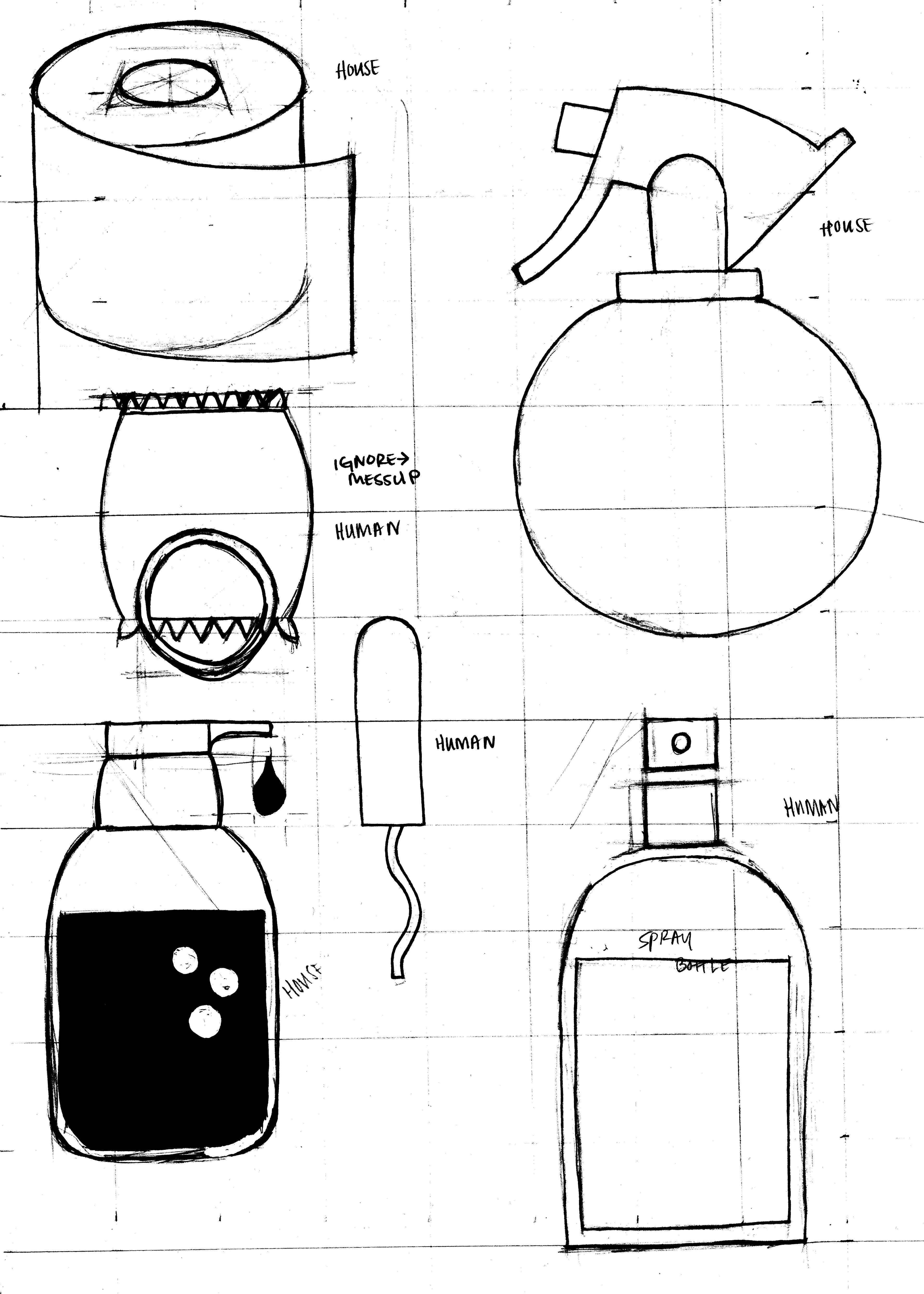
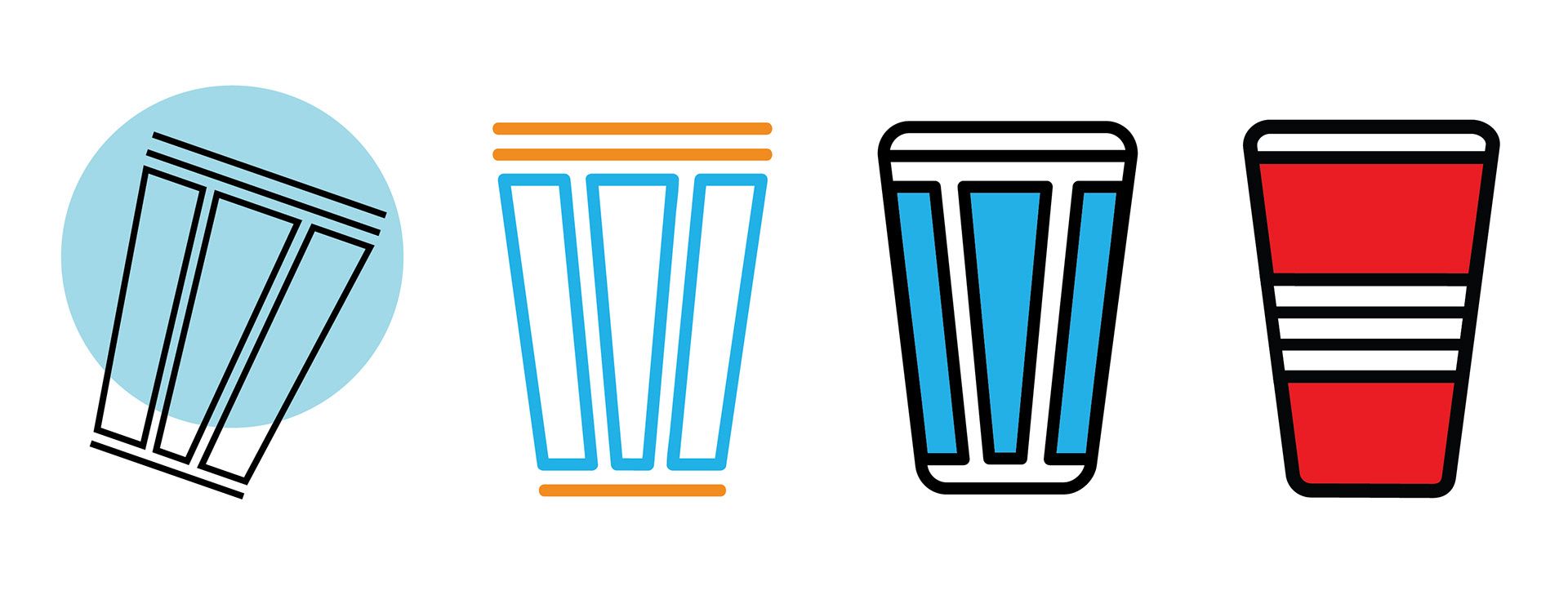
Icon evolution for alcohol section

My logo departure: simpler, bolder, more professional

Existing Logo 2019
Spring 2019
Class: Marks and Symbols
Time Frame: 1 Month


